Case study · Enterprise product
SCAN+
One scan. Multiple destinations. Zero repetition.
Maya scans a few times a month. Grace scans every day. They walk up to the same printer expecting the same thing: scan once, and send it everywhere it needs to go. On HP's new platform, they couldn't.



Role
Senior Designer
Worked with
Concept team, Pattern team, Firmware partners, Research
Platform
HP enterprise printers
Status
Designed, tested, handed off · Shipped in Intent First
01 / Overview
The problem
When HP moved its enterprise printers to a new platform, multi‑destination scanning didn't carry over. People rescanned the same document for every destination.
What I did
I turned the approved Scan+ concept into one system for email, network folder and SharePoint: setup, authentication, grouped contacts, verification, recovery and print in the same job.
Where it landed
The design was tested with users and handed off. Before it was built, the product moved to Intent First, and multi‑destination shipped as part of it. I later joined that work.
Interactive prototype · One scan, every destination
Scope
Destination setup
Authentication
Grouped contacts
Verification
Recovery
2 personas
3 research studies
How the work moved
Concept team
Tested, approved concept
Me
Use cases, edge cases, accessibility, detailed design
Pattern team
Reuse patterns, or request new ones
Firmware partners
Feasibility, then implementation
02 / Context
Scanning is not a feature. It is how work moves.
Enterprise printers sit at the centre of document-heavy workflows.

At scale
Patient records processed daily
Hospitals
High complexity
Multiple documents per case
Legal firms

Time-critical
Shipping documents in motion
24/7 logistics

High frequency
Daily operations and workflows
Corporate offices
Scanning is frequent. Speed is expected. Repetition creates friction.
When scanning slows down, work slows down.
03 / Problem
A platform upgrade quietly removed a workflow people relied on.
On the legacy platform, people could scan once and send to email, network folder, SharePoint and many other destinations together. The new platform was built for cloud-connected, AI-ready printing, but this capability didn't carry over.
The legacy platform had
Scan once, send to many destinations
Saved destinations and settings
One continuous job

The new platform was missing
One scan per destination
Setup repeated every time
Fragmented workflows

63%
Enterprise end users
Rated scan‑to‑email as their highest‑priority task.

64%
IT admins
Rated scan‑to‑network‑folder as very relevant.
23%
UX lift on the new platform
But the scanning workflow didn't improve.
The existing experience wasn't broken. It was simply tolerated. Repeated across thousands of users, every extra step became measurable inefficiency.
The task didn't change. The system no longer supported it.
Why bringing it back was hard
People
Expected one flow, and got disconnected workflows, repeated setup and no memory.
The system
Treated every destination as an island with its own logic, so every multi-destination job had to be rebuilt from scratch.
The platform
Limited what was possible: the design had to fit existing patterns and firmware limits while still feeling new.
This wasn't a flow redesign. It was reconstructing behaviour in an evolving system.

The brief became a dilemma
Improve the new platform, and lose nothing from the old one.
04 / Research & insights
People weren't adapting to the system. They were working around it.
3 studies with 200+ enterprise users.
01 · Before the concept
Foundational study on how people understood multi-destination scanning.
4 / 7
"Multiple" meant "more emails".
Most read "multiple destinations" as several email contacts, not kinds of places.
02 · Testing the concept
Usability test of two directions with 20 participants.
17 / 20
People thought destination first.
Participants chose where the scan should go before touching any settings.
03 · Refining the labels
Card sorting and naming research with 97 users.
40 / 52
The labels mostly landed.
40 of 52 found the labels fine; "More Destinations" lagged at 3.5/5.

Maya
Persona · Occasional walk-up user
"Walk up, finish the task, leave."
Needs
An obvious first screen, smart defaults and a forgiving flow.
Concern
Sending the wrong document to the wrong place.

Grace
Persona · High-volume daily user
"I have to type my own email address, even after I've signed in."
Needs
Saved destinations, several at once, and confidence before sending.
Priority
Every second saved multiplies across her jobs.
05 / Design direction
From feature design to outcome design.
The challenge wasn't redesigning scanning. It was restoring how people complete tasks.
Instead of asking
How do we improve each scanning flow?

We reframed it as
How can one scanning job hold several destinations?
The key shift
Destinations became outputs, not entry points. People defined the intent; the system handled delivery.
My role
My job was to make that answer hold for every destination, every entry point, and every way it could go wrong.
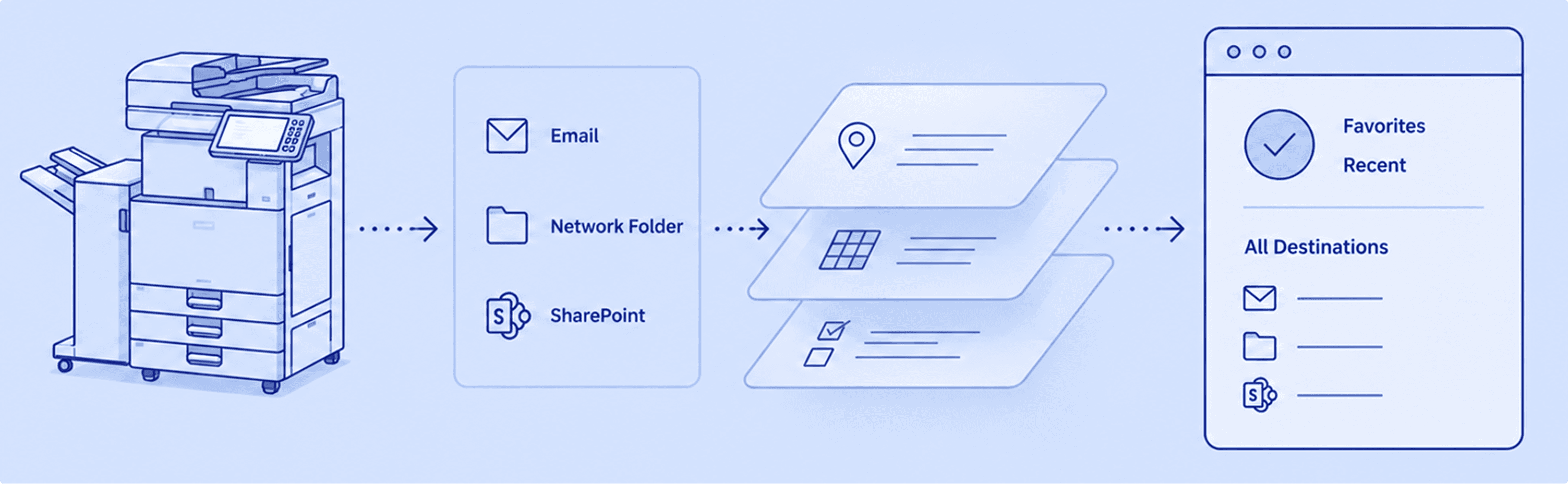

Recipients

Network folder
Access

SharePoint
Path + PIN

Printed copy
Print settings
46 / 52
people, asked to name one app that sends to many places at once, chose "Scan to All", "Scan+" or "Multi-Scan", suggesting the terminology would be understood without explanation.
Scan to All
Scan+
Multi-Scan
Four decisions shaped the system.
1
Preserve what works.
People routed around the system instead of adapting to it. Simplify on top of what they knew.
2
One interface, two behaviours.
Maya needed speed, Grace needed depth. Make the default obvious and keep power within reach.
3
Destinations first.
Memory mattered more than features. Build around the core workflow; layer the rest over time.
4
Firmware as a design partner.
Constraints surfaced through collaboration. Resolve them early, so trade-offs are made with full context.
Progressive disclosure
Simple by default. Powerful when needed.
06 / Testing the direction
What testing showed, and what it didn't.
Before the detailed design, both directions were tested in 20 usability sessions with enterprise end users, office managers and IT admins, in the lab and remotely.
20
usability sessions
3
user groups: end users, office managers and IT admins
2
settings: in the lab and remote
The concept team tested two directions. I took the one the evidence chose and made it work everywhere.

Concept A
One flat list with "Show more"
5
Overall preference
5
Destinations section
17/20
Saving a favourite · ease 3.87
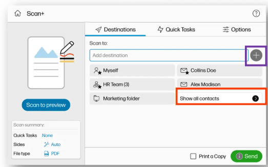
Concept B · Chosen
Grouped by destination type, actions next to each
13
Overall preference
14
Destinations section
18/20
Saving a favourite · ease 4.26
20 / 20
sent one scan to two different destinations in a single session.
4 / 20
skipped the folder they needed, because folders shared the person icon.
4 ways
different readings of the "+" button. Its purpose wasn't clear.
13 / 20
went back to check destinations and file type before sending.
What changed because of it
Selecting destinations worked. Managing them didn't, at first.
As a team, we:

Moved favourite and group controls next to destinations.
Gave each destination type its own icon.
Labelled entry points by where they lead.
Kept the scan summary before sending.
My part
Making each change work within the pattern library and firmware limits, across every destination.
What it didn't prove
The tests used prototypes.
Never measured in the tests:

Real delivery to several destination types.
Building a set from a blank screen.
Long-term learning.
Those would have been next.
Every decision had to pass one test
Does this let someone send one scan everywhere it needs to go, without repeating themselves?
07A / Decision · Combining destinations
One scan. Every destination.
Scan+ let people send a single scan to multiple destinations at once. Frequently used combinations surfaced through Favourites and Recents, reducing setup to a single tap.

Users could combine email, network folders, SharePoint and personal destinations into a single execution flow.
Key impact
Saved time by removing repetitive scanning.
Fewer errors from manual re-scans.
Consistent workflows across users and teams.
The reason
On the new platform, each destination was its own job. Grace, sending one contract to a client's email, a network folder and SharePoint, had to start over each time.
The choice
One field holds every destination type. People add any mix of email, network folder and SharePoint, including themselves, and can get a printed copy in the same job, then send once.

Address book · Browse mode
The address book adapted to the user's intent.
Users could browse across all destination types or choose one first. The same address book supported both modes.

One content layer.
Two intelligent modes.

Type-first mode
When intent was clear, people chose a destination type before browsing.

Filtered mode
The address book narrowed to only what matched the selected type.
34 / 52
Every entry point has to say where it leads.
A familiar contacts icon matched expectations for 34 of 52 people; a vague "More Destinations" split them five ways. So entry points were labelled by destination type, and each type got its own icon.
"It's one more click, but it's a lot more intuitive." (IT admin)
The trade-off
More entry points means more to learn. I kept them consistent, so every route leads to the same chip, the same details and the same controls.

For Maya · Auto suggestion
Users typed intent, not full addresses.
Users didn't need to remember exact addresses. They could start typing, choose from directory suggestions, and continue with a clean destination chip.

Selection became a chip
Once selected, only the display name stayed visible in the field.

Details stayed accessible
Tapping the chip revealed the underlying destination details.
The field stayed simple. The details stayed accessible.
One contact. Multiple destinations.
Groups and multi-destination contacts went in as a single chip, without giving up control of what was inside.

01 · Multi-destination contact
One chip, every address inside.
One address book entry held email, fax and network folder destinations.

02 · Destinations revealed
Tapping the chip exposed every destination inside the contact.

03 · Selection refined
Specific destinations could be removed without losing the rest.
Added as one. Controlled as many.
Email composition stayed inside the scan flow.
Enterprise scans often involved more than one recipient. Scan+ brought To, CC and BCC into the destination panel, so email delivery was composed without switching tools.
Email · Step 01 · Entry
Chosen from More Destinations.
Email was picked the same way as a folder or a SharePoint site.

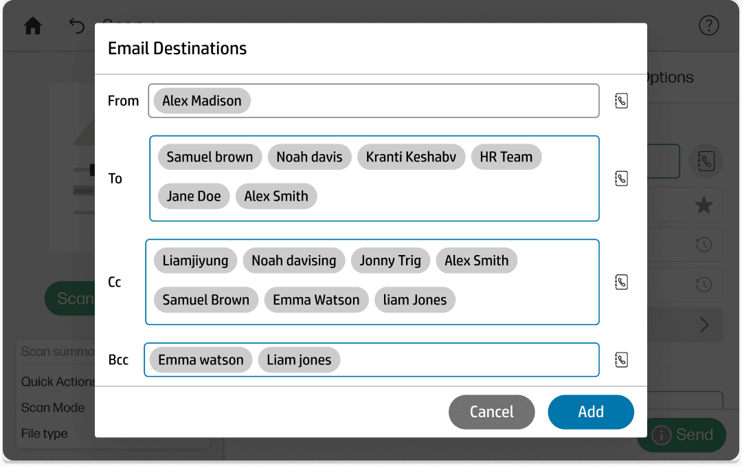
Email · Step 02 · The key step
Recipients composed in flow.
To, CC and BCC supported direct, copied and blind-copied recipients. 9 in 10 people said "To" mattered most, so CC and BCC stayed one tap away.
Email · Step 03 · Exit
Back on the scan panel as one destination.
Every recipient returned as a single configured email destination, ready to send with the rest.

No app switching. Full email logic inside the scan.
SharePoint
Authentication entered the scan flow without breaking it.
SharePoint required users to verify access before sending. Scan+ kept authentication inside the familiar destination flow, so people could choose a path, enter a PIN and return to scanning without switching context.

SharePoint · Step 01
Path selected inside the destination panel.
People browsed SharePoint locations and chose the path without leaving the scan.

SharePoint · Step 02
PIN entered in flow.
Sign-in appeared as a familiar printer step, not a separate system detour.

SharePoint · Step 03
Back in the job.
Once verified, the SharePoint path returned to the scan panel alongside every other destination.
Secure when needed. Familiar by design.
SharePoint · Quick Sets
Quick Sets made repeated workflows one tap away.
Power users often scanned to the same SharePoint locations every day. Instead of repeating setup each time, Scan+ surfaced saved configurations directly in the destination flow.

Quick Sets · Step 01
Entered from destinations.
Users accessed SharePoint from More Destinations.

Quick Sets · Step 02
Saved path selected.
A saved SharePoint configuration could be chosen without rebuilding the path.

Quick Sets · Step 03
Added to scan.
The selected Quick Set returned to the scan panel as a ready-to-send destination.
Configured once. Recalled in one tap.
07B / Decision · Network folder
Network Folder stress-tested the destination model.
Network Folder carried the highest technical load. Search, contacts, manual setup, Quick Sets and subfolders all had to resolve into one consistent destination behaviour.
01 · Different ways in
Different entry points. One destination model.
Search, contacts, Quick Sets or manual setup, all resolving into one destination model.

Search
Start with a folder name or path.

Contacts
Select a contact that contains a folder destination.

Quick Sets
Recall saved folder workflows.

Manual setup
Enter path, credentials, and verify connection.
02 · Verification
Verification happened inline, not as a separate gate.
When people entered a network folder path, Scan+ verified access where the work was happening. Authentication and connection checks stayed inside the destination flow, so people didn't lose context.
61.5%
ranked the destination as the most important field.
1.9%
of rankings even mentioned "verify", and no one put it first. People needed access checked; they didn't want to manage it.
Verification · Step 01
Path entered in flow
People entered the folder path inside the destination panel.

Verification · Step 02
Verification stayed inline
Authentication and connection checks stayed in the same context.


Verification · Step 03
Destination added
Once verified, the folder returned as a configured destination.

Status at a glance
Every network folder path shows whether it is verified, not verified, or yet to verify.
The negotiation
Keep the checks. Make the status clear.

User need
Fewer interruptions

Firmware constraint
Verification at multiple stages
Best user flow
Buildable solution

Balancing user flow with firmware constraints.
The agreement
Required checks stayed. Each folder's status became visible.
Firmware needed verification at multiple stages. I agreed to retain those checks and proposed showing each network folder path with its status, so people could see where every folder stood.
Firmware: required verification
People: visibility instead of surprises
Every gate is a context break. Verification stayed in flow.
03 · Recovery
When verification failed, the flow stayed intact.
Wrong paths, stale credentials and timed-out connections were expected. Instead of forcing a restart, Scan+ surfaced each failure where the work was happening.
Recovery · Step 01
Failure surfaced inline
The system named the issue in the same panel.

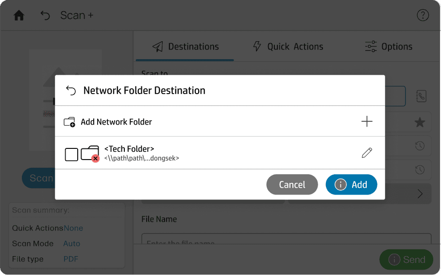
Recovery · Step 02
Correction stayed in context
Users could retry credentials or update the path without restarting.
Recovery · Step 03
Recovery without restart
Once corrected, the destination was added and the scan continued.


The design assumed failure. It planned the recovery.
04 · Subfolders
Verified paths could go deeper.
Enterprise folder structures were rarely flat. Once a parent path was verified, people could move into nested subfolders without signing in again or restarting the setup.
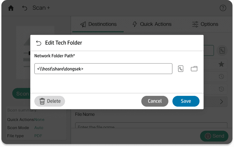
Subfolders · Step 01
Browsing inside a verified path
After verification, the folder opened for browsing in place.
Subfolders · Step 02
Path updated as they moved
The destination path reflected the selected folder level, updating with every level people opened.


Subfolders · Step 03
Subfolder added as destination
The selected subfolder returned to the panel like any other destination.
Verified once. Navigable all the way down.

05 · Quick Sets
Quick Sets made trusted paths instant.
Some network folders were used every day. Quick Sets saved the path, credentials and defaults in admin settings (EWS, HP's Embedded Web Server), so the printer could recall the destination without rebuilding the flow.
Folder Quick Sets · Step 01
Entered from destinations
Quick Sets sat alongside the other ways into a destination.


Folder Quick Sets · Step 02
Quick Set recalled.
A saved folder workflow loaded with its settings.

Folder Quick Sets · Step 03
Ready to scan.
The job was ready without re-entering a path or signing in.
Setup happened in EWS. Recall happened in one tap.
Print a Copy
Print became another destination.
Scan+ kept Print a Copy, then integrated it into the same destination model as email, network folder and SharePoint. Physical output could now be configured and sent in the same scan job as digital destinations.
Print a Copy · Step 01
Print a Copy selected
Selectable like any other destination.


Print a Copy · Step 02
Copy options set inline.
Copies, sides and colour were set without leaving the scan flow.
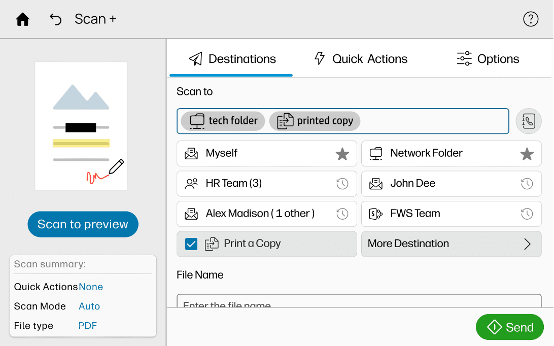
Print a Copy · Step 03
Print and digital together.
A printed copy could be sent alongside digital destinations in the same scan job.
Multiple Print a Copy destinations, each with its own settings.
07C / Decision · Failure recovery
Failure had a type. Recovery had one answer.
Different destinations failed in different ways. Setup that was missing. Access that was denied. Inputs that were malformed. The system named each failure inline, then offered one consistent recovery across all of them.
01 · Setup and authentication
Setup and authentication failure
The system named missing setup or denied access where the destination was selected.


02 · Input
Input failure
Input failures happened when a value was malformed, caught before the scan was sent.


03 · Recovery
Same recovery model
Correct the issue or remove the failed destination without collapsing the rest of the job.


Every failure had the same recovery: remove the failed destination, keep the job.
08 / Outcome
Designed, tested, handed off.
What once took multiple jobs became one: a contract going to a client's email, a network folder and SharePoint, with a printed copy.
On the new platform
Separate jobs for each destination.
Configure. Authenticate. Wait. Repeat.
With Scan+
One destination list. One document. One send.
01
Designed
02
Tested
03
Handed off
04
Shipped in Intent First
Future scope
The destination model was only the foundation.
In parallel, the concept team explored how people could configure, speed up and review the job before sending.
Options
Adjust file type, colour, resolution, sides and quality without leaving the flow.
Quick Actions
Reusable presets bring frequent scan workflows closer to one tap.
Preview & Edit
Review pages before sending; rotate, reorder, delete or add pages.
09 / The pivot
Scan+ did not ship. And that is part of the story.
1
The reason was not design failure. It was a broader shift in how the organisation understood the problem.
2
Scan was not only hard to complete. It was hard to find across multiple walk-up apps.
3
That reframed the work from improving one feature to reorganising print and scan around user outcomes.
4
Scan+ had already moved in that direction, and multi-destination shipped as part of Intent First.
Old state · Fragmented
Multiple walk-up apps
Scan was hard to find

Print Release


USB Print

Cloud Storage

Scan

My Account

New state · Intent First
Outcomes first
Organised by what people want to do
Release, manage, deliver

Scan
Capture, send, save

For me and my team
Multi-user
Where the work went

Destination-first flows
Start from the outcome, not the app.

Progressive disclosure
Show what's needed, when it's needed.

Inline recovery
Fix issues in context and keep momentum.

Multi-user behaviour
Designed for individuals and teams.
I later joined the Intent First work, and these principles came with me.

Scan+ didn't ship as Scan+. Multi-destination did, through Intent First.
10 / Reflection
Completeness felt right. Momentum would have been smarter.
Designing Scan+ was a series of trade-offs. Every constraint became a design surface.
Simplicity vs control
Casual users needed speed. Power users needed depth. Progressive disclosure kept the main flow simple and advanced controls available.
Legacy vs modernisation
Legacy users carried years of learned behaviour. The new platform had to modernise without feeling unfamiliar.
UX vision vs firmware
The best flow wasn't always the easiest to build. Network folder authentication became a deliberate trade-off for continuity.
Completeness vs momentum
Scoping every destination together made the first wave fragile. One destination at a time would have been smarter.
Three things worth naming
01
Complexity is a system problem, not a user problem.
Enterprise scanning is complex underneath; the user shouldn't feel it. Network Folder tested this clearly: the best decision was the one people never noticed.
02
Alignment is part of design, not overhead.
Working across the concept team, pattern team, firmware and QA meant constant negotiation. Surfacing constraints early made the design buildable.

03
Build the foundation first.
Next time: agree shared patterns first, ship email and network folder, then expand. Momentum would have reduced dependency.

Next time, I'd get it into their hands sooner.
What's next


Intent First
Where multi-destination shipped: print and scan organised around what people want to do.
View case study →

One Station One Product
Turning Gujarat's craft diversity into a station-ready product strategy.
View case study →
← Back to all work
Connect
Have a complex product problem worth untangling?
© Bhawna Tak · Strategic Product Designer
Bengaluru, India
2026
Moved favourite and group controls next to destinations